CHOCO • REBRAND
Designing a brand that moves like its users do
Global Strategy & Brand Identity for Choco
IDEA
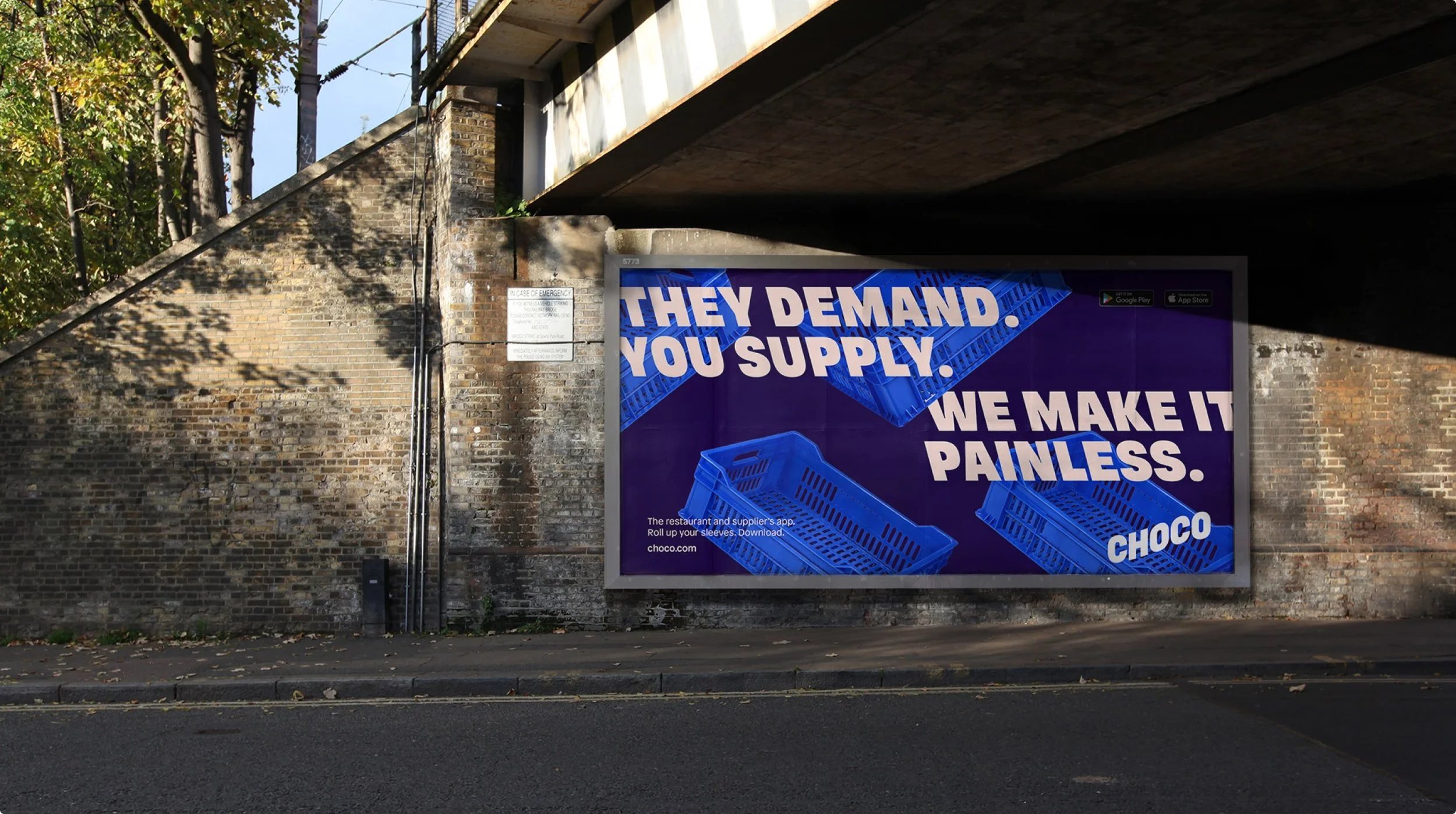
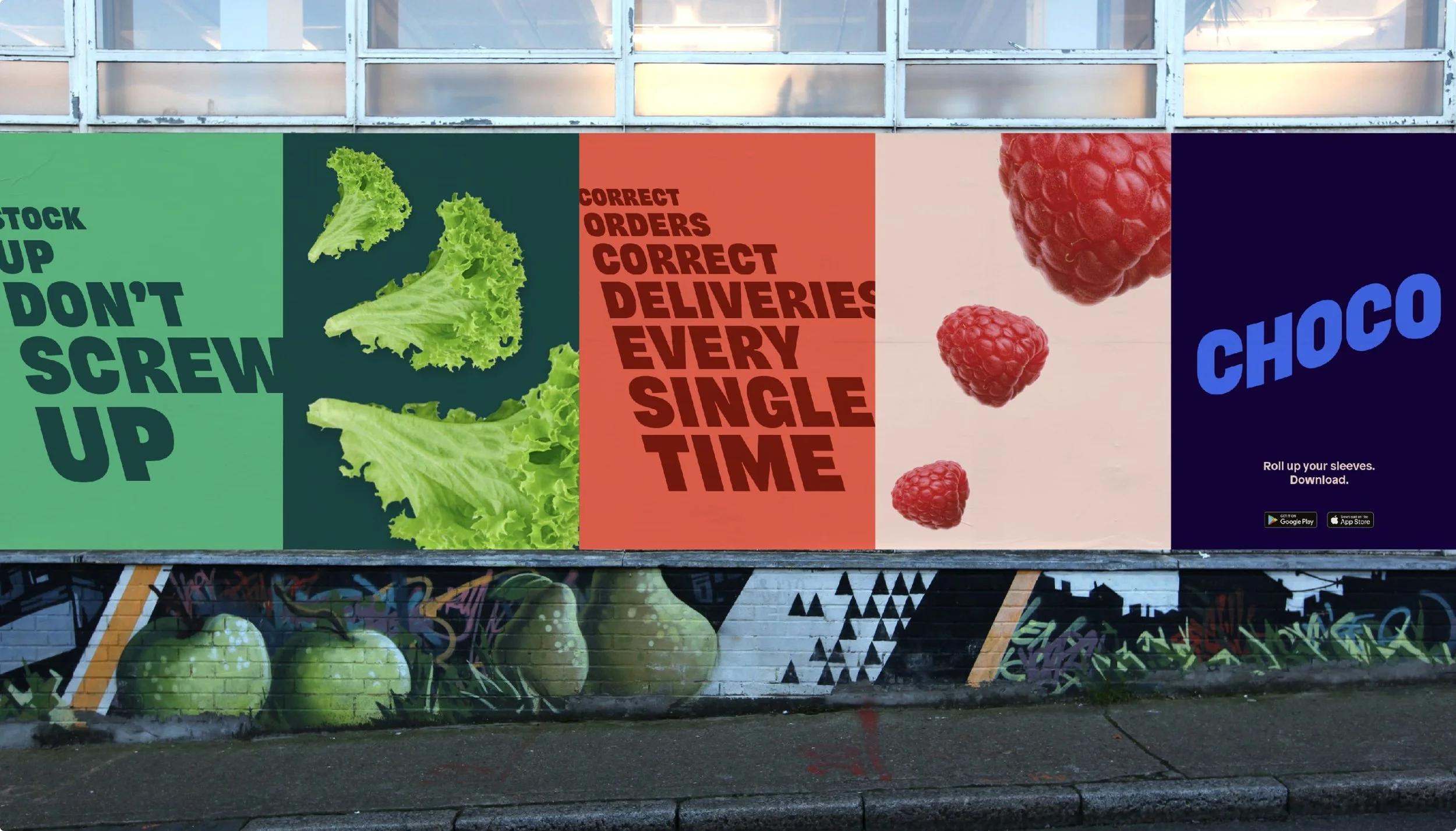
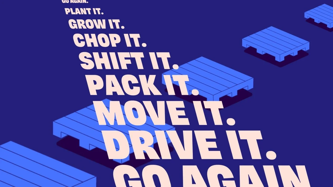
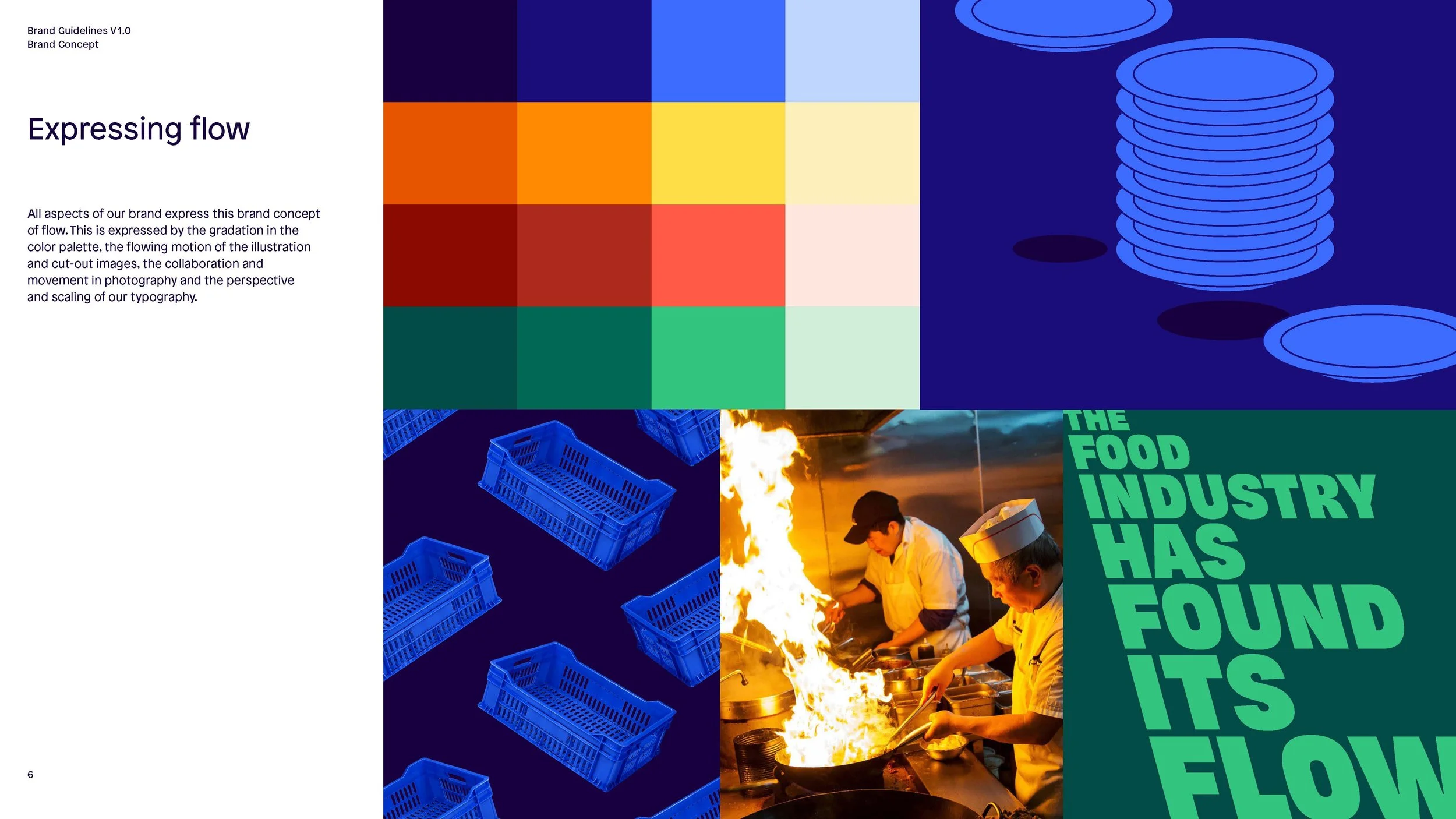
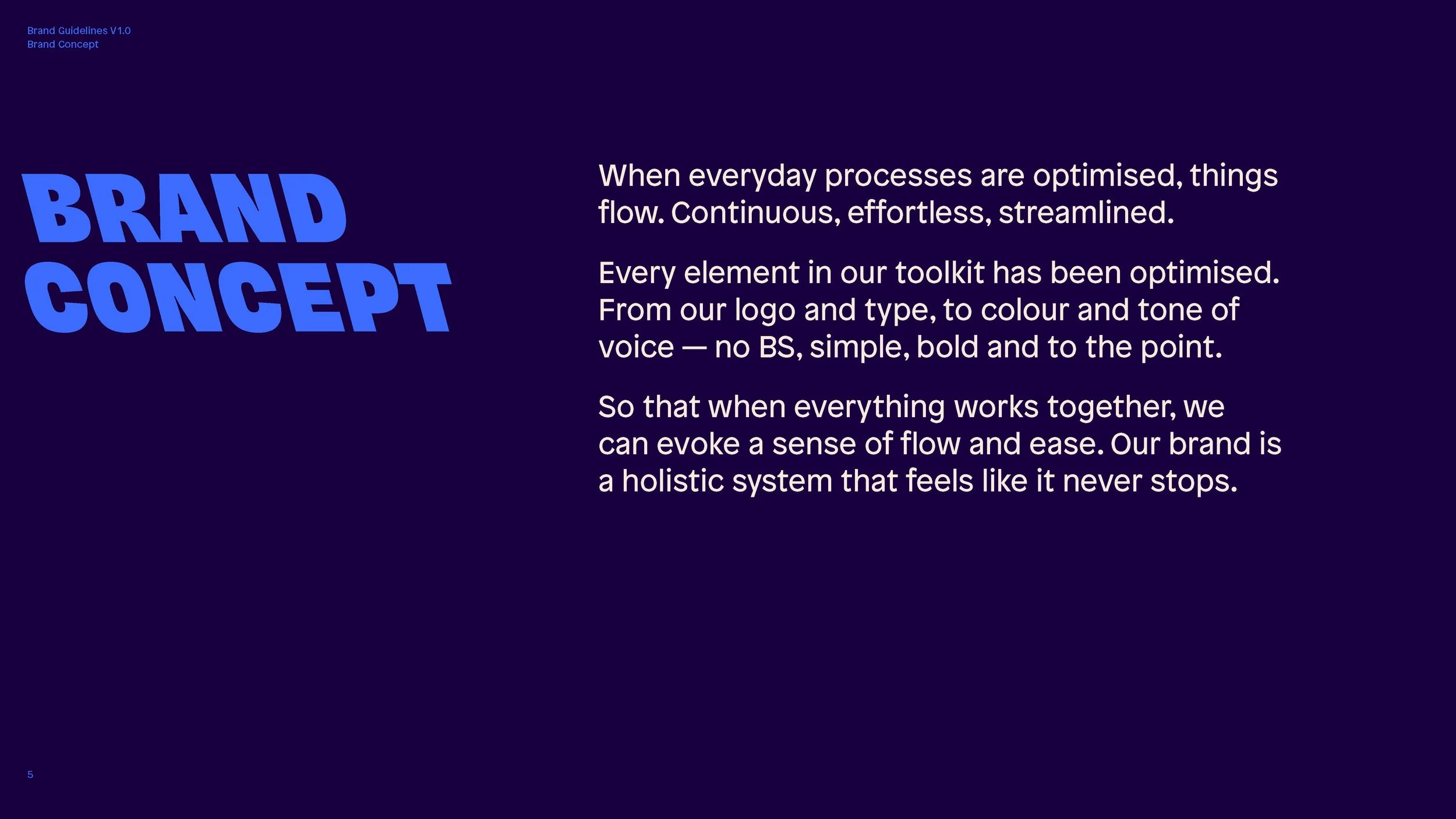
Tap into Choco’s unique rhythm — a fast-moving, frictionless energy built on hustle, humour, and straight talk. The concept of State of Flow became the driving principle: a brand system that never stalls, stutters, or slows down — just like the chefs and startups it serves.
INSIGHT
Choco’s vision was bold: optimise the global food supply system and fight waste — starting with one deceptively simple tool for chefs and suppliers. The challenge was to craft a strategy that matched the scale of the mission and the pace of the industry, without losing the irreverent, meme-fuelled culture that made Choco feel alive.
Summary
SCOPE & DELIVERABLES
Brand Strategy: Positioning, Manifesto, Purpose
Narrative Platform & Messaging System
Verbal Identity & Brand Voice
Visual Identity: Type, Motion, UX & Activation
Brand Playbook & Internal Launch Support
OUTCOME
The identity flows across every brand touchpoint — from looping illustrations to dynamic typography and no-fuss messaging. The new system helped onboard 15,000+ chefs and 10,000+ suppliers, streamlining over 500,000 orders a month. Less waste, less chaos, more flow.
CLIENT
Choco
Role: Strategist & Cultures Researcher